Monday, October 31, 2011

Scale Value Fish with Matt Duffin


Discussion: 
Scale: big and little
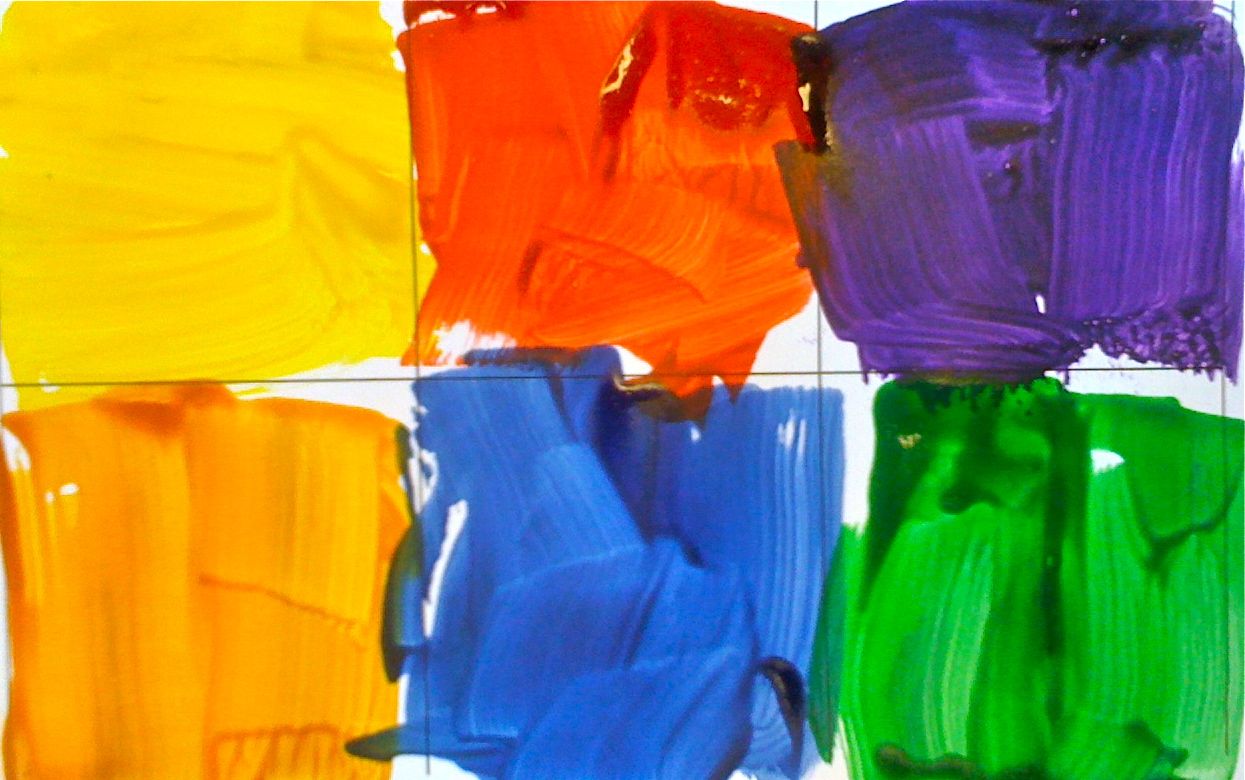
What colors has he chosen?
Value chart? what is value?
How do we make colors lighter?
How do we make them darker?
Lines: what lines do we see, what lines can you think of?
Look at Matt Duffin's, Crowd Control, 2006 on display at Crocker Art Museum, Sacramento, CA
Does this painting remind you of a scene in the Wizard of Oz?
What is happening behind the curtain?
Why donkeys? are they smart?
What are they standing?
What is the artist trying to say?


ARTIST: Matt Duffin (1968-)
He grew up in Houston, Texas. 
He received his Bachelor of Science in Architecture from the University of Houston. 
He never practiced as an architect, choosing instead to become an artist. Through art, he found that he could easily combine his tendency toward right angles and persecutive drawing with the more human themes of solitude and irony. 
Over time, his medium has evolved from charcoal to encaustic wax, but he continues to dwell in the realm of dark recesses and stark contrasts. 
PRACTICE: on practice paper try drawing fish. 
First reduce them down to two shapes: triangle, oval
Second: add details: fins, gils, scales, tail lines, 
Now try drawing a very large fish almost the size of your paper
use the same techniques and details but make this fish have its mouth open
remember this is just practice drawing shapes, line and details.
Project: Big Mouth Fish
Step1: using a pencil draw a school of fish, at least 12, all the same on one half of your paper
Step2: On the other half draw a large fish mouth, from the side, big enough to eat the whole school.
Step3: using only black and white paint create 5 shades of grey
Step4: paint in your fish fight drawing using only grey paint.
Step5: using all your light shades of grey add in bubbles around the fish using different sized circles use straws, toothpicks, and bottle caps for the large fish. 
Materials:
12x18 thick white paper
Tempura Black and white paint
Bowls or small cups to make new colors
straws


Warm Sunsets with Van Gogh


DISCUSSION: 
Warm Colors
Positive space
Negative space
Landscapes
Trees
Van Gogh
Van Gogh's:  Landscape at Sunset
ARTIST: Van Gogh
VAN GOGH
Vincent  van Gogh (30 March 1853 – 29 July 1890)
His work had a far-reaching influence on 20th century art
Known for his  vivid colors and emotional impact. 
Van Gogh did not begin painting until his late twenties
most of his best-known works were produced during his final two years. 
He produced more than 2,000 artworks, consisting of around 900 paintings and 1,100 drawings and sketches. 
His work was a strong influence on the Modernist art that followed. 
Today many of his pieces—including his numerous self portraits, landscapes, portraits and sunflowers—are among the world's most recognizable and expensive works of art.
Known for his paint application creating texture and movement.
He suffered from anxiety and increasingly frequent bouts of mental illness throughout his life,
died largely unknown, at the age of 37
sold only one painting while he was alive
PROJECT:
Step 1: paint your sunset in warm colors of watercolor
Step2: Using pencils draw three trees across your black paper 
Step3: carefully cut out your trees leaving your land to hold the three trees together
Step4: Paste your black paper on your watercolor sunset
MATERIALS: 
Thick paper
Paint white and black
Paint brushes
Water
Scissors
glue


Friday, October 28, 2011

Line, Pattern and Repetition with Alexander Calder


DISCUSSION: LINE, Repetition, Pattern
What is a line? 
What kinds of lines can you think of?
Where do we see line in Nature?
         What happens when you repeat the same line over and over?
            pattern like fish scales. 
  Look at Alexander Calder, Gold Fish Bowl, 1929, wire, 16 x 15 x 6"
                    talk about all the different lines you see.

ARTIST: Alexander Calder
(22 July 1898 – 11 November 1976)
famous for inventing the mobile
Alexander Calder also created paintings, lithographs, toys, tapestry and jewelry.
Salmon:  Show the pictures of the fish
What do you see?
How do it’s colors protect it?
                 The gray on the top of the fish protect it from predators above.
                 The pink on the bottom of the fish protect it from predators below.
             Where do you see line/shape/texture?
PROJECT: draw Salmon using lines inspired by Calder
WORK TOGETHER ON THE PROJECT SO YOU DON’T LEAVE ANYONE BEHIND
Sharpie:
Step 1: draw the oval shape of the fish body
Step2: draw each of the fish fins and it’s eye
Step3: use the letter C  lines to create scales on the bottom of the  body
Step4: use straight lines to define each of the fins
Step5: use  a curved line to draw in the gills
Step6: draw circles on the top of the body to look like rocks
Step7: use simple lines to create plant life on the bottom of the page
Watercolor:
Use grays and greens for the top of the body
Use: pinks  for the bottom of the body
Use: any colors you choose for the plant life
Use: blues to fill in the remaining white of your page for water
METALLIC WATERCOLOR:
Use silver to  add some  metallic shine to your fish body
MATERIALS: 
Watercolor tins,      sharpies,      brushes,       water,       cups
Liquid watercolors in: pink, blue, green, grey, orange, one mettalic


Wednesday, October 26, 2011

Warm and Cool Hearts with Jim Dine


PREPARATION: precut Heart stencils from card stock and tape them to the table. Students will slip their paper underneath. 

DISCUSSION: Warm and Cool Colors
What are warm colors?
How do they make us feel?
Where/When do we see them?
What are cool colors?
How can they make us feel?
Where/when do we see them?
ARTIST
Jim Dine born June 16, 1935
He is sometimes considered to be a part of the Neo-Dada movement. 
He was born in Cincinnati, Ohio
He attended the University of Cincinnati and received a BFA from Ohio University 
 He first earned respect in the art world with his Happenings
Pioneered with artists Claes Oldenburg and Allan Kaprow, the "Happenings" were chaotic performance art that was a stark contrast with the more somber mood of the expressionists popular in the New York art world. 
In 1962 Dine's work was included, along with Roy Lichtenstein, Andy Warhol and Wayne Thiebaud, in the historically important New Painting of Common Objects.
This exhibition is historically considered one of the first "Pop Art" exhibitions in America
Jim Dine’s Hearts were included in this exhibit
PROJECT: create oil pastel heart with stencil  
Step 1: name on paper
Step2: place stencil on paper and tape down
Step3: Color inside the stencil with warm oil pastels
Step4: remove stencil
Step5: fill in background with cool color of water colors
Step6: place on drying rack
MATERIALS:
Heart stencils
Oil pastels
Liquid watercolors in cool colors


Monday, October 24, 2011

Primary colors with Mondrain


Discussion
Primary colors
What does primary mean?
What do primary colors do?
Where do colors come from?
Art and Artist
what was the artist trying to say by using only line and primary colors?
ARTIST: Piet  Mondrian
1872 – 1944),
He was a Dutch painter.
He was an important contributor to the De Stijl art movement and group
He evolved a form that consisted of white ground, upon which was painted a grid of vertical and horizontal black lines and the three primary colors.[1]
he termed his artwork Neo-Plasticism
In his most famous works: The black lines are the flattest elements, with the least amount of depth. 
The colored forms have the most obvious brush strokes, all running in one direction. Most interesting, however, are the white forms, which clearly have been painted in layers, using brush strokes running in different directions. 
This generates a greater sense of depth in the white forms, as though they are overwhelming the lines and the colors, which indeed they were.

PREPARATION: cut strips of black lines in short and long lengths. 
Project: Collage/painting inspired by Mondrian
Step1: using pre-cut black lines glue in grid like Mondrians
Step2: add as many or as few as you like
TO PREVENT COLOR MIXING: hand out plates of red paint, yellow paint and blue paint with brushes. do not put all three colors on one plate. 
Step3: in one small square add in the color red
Step4: in one small square add in color blue
step5: in one small square add in color yellow
Step6: make artist decisions about adding more square of colors and/or more black lines
MATERIALS: 
Pre-cut black lines
Tempura paint in red blue and yellow
glue sticks 
Scissors


Friday, October 21, 2011


PREPARATION: create grid paper with six blocks 

DISCUSSION: 
Colors: what is color?
Where does it come from
What colors come first?
Primary colors
Name the primary colors
What colors make all other colors
What colors come second
Look at : Gerhard Richter’s 4900 Colours: Version II via Serpentine Gallery
artist

Artist
Gerhard Richter(born February 9, 1932) 
Known for his blurred painting of photographs
Known for abstract paintings of pulled paint

Project: 
Create a Gerhard Richter style square artwork by painting primary and secondary colors in a grid
Step1: paint in primary colors
Step2: paint in secondary colors
Step3: do your best job to stay in the lines
MATERIALS:
paint
Brushes
Grid paper


Discussion: line 
shape, circles
still life
horizontal 
vertical

Artist: Cezanne
Paul Cézanne  (1839 – 1906) 
His work laid the foundations of the transition from the 19th century conception of artistic endeavor to a new and radically different world of art in the 20th century. 
Cézanne can be said to form the bridge between late 19th century Impressionism and the early 20th century's new line of artistic enquiry, Cubism
The line attributed to both Matisse and Picasso that Cézanne "is the father of us all" 
Cézanne's work demonstrates a mastery of design, color, tone, composition and draughtsmanship. 
His often repetitive, sensitive and exploratory brushstrokes are highly characteristic and clearly recognizable. 
He used planes of color and small brushstrokes that build up to form complex fields, at once both a direct expression of the sensations of the observing eye and an abstraction from observed nature. 
The paintings convey Cézanne's intense study of his subjects, a searching gaze and a dogged struggle to deal with the complexity of human visual perception.
for additional information, please visit: http://en.wikipedia.org/wiki/Paul_Cézanne

PREPARATION: precut apple circles in shades of green and yellow and strips of red lines in advance. 

Project: collage apple shape still life on line picnic blanket
Step1: one a sheet of white card stock, students will place three line of red horizontal
step2: one a sheet of white card stock, students will place three line of red vertical
Step3: glue in three circles in different apple shades pink, yellow, lime green on top of your picnic paper
Step4: using a brown crayon, add the stem of each apple on top.
Materials: 
half sheet white card stock
1” cut red lines
Glue sticks
circles in shades of green and yellow
brown crayon