Showing posts with label primary colors. Show all posts

Tuesday, August 2, 2016

Color Theory Art Supplies


Lesson Objective: Study Josef Albers and Color Theory 
Apply knowledge to a still life of art supplies done in 9 different color schemes
Key Vocabulary: 
Hue is the term given to the various colors we perceive e.g., red, blue, green, red-purple, Value is the lightness or darkness of a hue
Value is higher (lighter) when there is more lightness. (Tint)
Value is lower (darker) when the hue appears darker. (Shade)
Saturation, purity of color, refers to the comparison of a color to a neutral gray 
Neutral gray is achromatic 
Full color is fully saturated/pure and brilliant: Chroma
Saturation levels vary with different hues:
The most intense yellow appears brighter than the most intense blue-green. For any hue, saturation ranges from 0 percent (neutral gray) to 100% (maximum saturation). 
At maximum level, 100%, color appears pure and contains no gray
Contrast: refers to one object's difference in color and luminance compared to its surroundings or background. Black and white Highest possible Contrast 
Scale refers to relating size to a constant, such as a human body.
Color Theory: is a body of practical guidance to color mixing and the visual effects of a specific color combinations
Complementary colors: Opposite on color wheel (High Contrast) 
A Hue will appear darker on lighter background and lighter on darker background
Proportion is the size relationship of parts to a whole and to one another. 

Materials: 
12x12 card stock
Colored pencils
Sharpies
Still life of art supplies

Focus Artist: Josef Albers 
Project requirements: 
Create a Slotted color sculpture exploring color relationships 
Sketchbook: Students will draw color plans for each square of their project and
submit plans for approval. Required: 
9 Different color schemes
Student/teacher should be able to easily identify theme

Project: Create 12x12 study on paper exploring Josef Albers studies on color
Precision: Focused effort on end result 
Assessment: 
Informal: Written Peer Critique
Formal: Artist Statement
Formal: Grading final sculpture

CA STANDARDS: 
1.1 Identify and use the principles of design to discuss, analyze, and write about visual aspects in the environment and in works of art, including their own. 
1.3 Research and analyze the work of an artist and write about the artist's distinctive style and its contribution to the meaning of the work.
1.5 Analyze the material used by a given artist and describe how its use influences the meaning of the work.
2.2 Plan and create works of art that reflect complex ideas, such as distortion, color theory, arbitrary color, scale, expressive content, and real versus virtual. 
4.5 Employ the conventions of art criticism in writing and speaking about works of art.
5.2 Compare and contrast works of art, beyond the obvious and identifying psychological content found in the images

Modifications: 
English Language Learner: Handout for project, project samples, Power point with visuals, Critique for additional understanding, Demonstration of techniques
Special Needs: Handout for project, project samples, Power point with visuals, Critique for additional understanding, Demonstration of techniques
Accelerated Learner: Expand on skills learned to create a unique project. 

Color has a huge effect on our daily lives.
Everyday our emotions, moods,  physical sensation (appetite) are influenced by the colors that surround us.
There are three (3) properties to color:  
Hue: the name we give to a color (red, blue, etc.).
Intensity: refers to the strength/vividness of the color. For example, we may describe the color blue as "royal" (bright, rich, vibrant) or "dull" (grayed).
Value: meaning its lightness or darkness. Shade and Tint are in reference to value changes in colors.

Scaffolding adaptations: 
Students will revisit color and line from the earlier learning. We will use similar visuals to refresh earlier learning.  Notes on color, scale and artists will be taken throughout discussions for added understanding. Creating sketchbook plans and Constructing final sculpture will be demo started in class using guided instruction.

DIRECT INSTRUCTION:
Day 1 and 2: Power Point Presentation Color and Albers
Pre-assessment: Science and Art
Opening: Art Link: Quote from Albers on Science and Art
Review: Elements of art 
Discussion: Color
Key Vocabulary featured on PPT with visuals: 
Hue
Value
Intensity
Chroma
Saturation
Contrast 
Complementary Colors
Simultaneous Contrast 
Successive Contrast 
Color Schemes (relationships)

ART HISTORY: Josef Albers
Josef Albers (1888 – 1976)
German-born American artist and educator 
He worked, both in Europe and in the United States
Taught at Yale University
He formed the basis for the most influential and far-reaching art education programs of the 20th century.
Alber’s had an endless fascination with color discrepancy: 
How colors look when seen one at a time 
How they appear in different combinations
Color Theory: The study of Color 
Albers noted experiencing color varies based on individual personalities and factors like hue, dimension, and placement.
1949-1976, Josef Albers created a series of paintings titled Homage to the Square. 
Experience is the best teacher of color. 
There is no shortcut to your 10,000 hours towards mastery of this subject. 
Unless you experiment with colors the way Albers prescribes, you will not fully comprehend how the exact same color:
 Looks different in small quantity vs. large quantity 
 Looks different surrounded by another color. 
Color is constantly related to its neighbors and to changing light conditions.
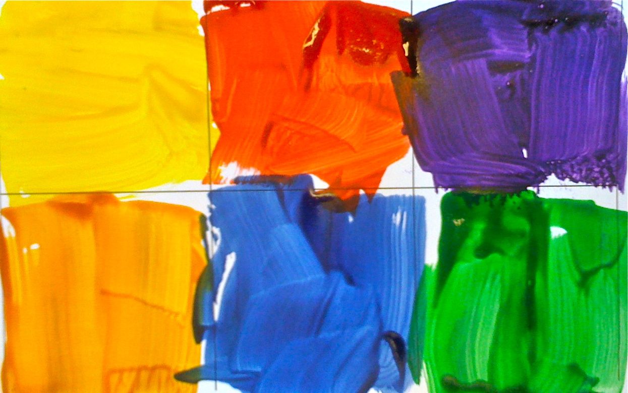
Albers chose the square for its neutrality
He felt that such a common shape would not distract viewers from their experience of color. 
To create a "pure" experience, he applied his pigments directly from the tubes.
Spread pigments in thin layers onto the surface of the canvas (No Texture)
Studied color with paint on paper
Avoids mixing paint
Saves time and materials
Gain active interest, no prep
Precision of tone, light and surface quality
No texture (i.e. brush strokes)
Intensity is a synonym for magnitude or strength.
Contrast: refers to one object's difference in color and luminance compared to its surroundings or background.
Black and white
Complementary colors: Opposite on color wheel
Monochromatic colors are all the colors (tints, tones, and shades) of a single hue. 
Huedoku: Students play the app Huedoku to see their learning at work. The app is created from Albers studies and allows students to place colors in the right order based on hue. Students will both watch and play. Student playing will be active in color placement students watching will observe how color changes based on its neighbors. 

Review each Color scheme on last slide to check for understanding 
Teacher Models: 
Color throughout discussion 
Students take notes in their sketchbooks 
Teacher Monitors throughout discussion
The game Huedoku on how to play with three color boxes 
Check for Understanding: 
Monitor room during Pre-assessment in sketchbook
Monitor throughout discussion ensure comprehension and active note taking 
Students play the Huedoku App with 4 color boxes and higher


Project: 
Day one: Students complete study of ideas in their sketchbook. 
Ideas should include various art supplies, 9 boxes and different color schemes
Day two: Students continue with their plans and submit for approval and large paper
Day three students begin on large paper by scaling up ideas to meet the 12x12 paper
Day four: students begin to map out each color scheme considering foreground, background etc. 
Day 5,6,7: student implement ideas through precision and knowledge 
Final product should include Light, Shadow and Value
Day 8: Critique 

Day 9: submit final work for a grade. 


Wednesday, November 7, 2012

Movement Color Wheels with Elizabeth Murray


Discussion: 
Primary colors, RED YELLOW Blue 
What are they? Why are they so important? 
What does Primary Mean
Why are they so important/what do they do? 
Secondary colors ORANGE GREEN PURPLE
What are they
Create a color wheel
Show the colors mixing
Show Murray’s work
Discuss color
Discuss shape 
        If you could go into the artwork, where would you travel first?
Discuss Music
Discuss movement
Bring MoMA app on Ipad if you have it. 

ARTIST: Elizabeth Murray (1940-2007):
Inspired by Abstract Expressionist Jackson Pollock’s work, as well as Pablo Picasso’s Cubist works, American painter Elizabeth Murray’s oeuvre span styles from a Minimalist use form and color to bold, cartoonish Surrealism
Her works push the boundaries of a two-dimensional medium;
The irregular triangles in the “Giant Maiden” series (1972) strain against the edges of canvases painted in high relief, 
While the explosive colors on an intricate collage-like canvas in Do the Dance (2005) lend the Painting a kinetic, almost optical quality.

Project: Create Murray inspired shape drawing and mix primary and secondary colors
Step1: draw a circle on the left part of your page, the size of your fist
Step2: Draw an organic shape/circle next to the first, lower and on the right side but have it touching the first
Step3: Draw a third organic shape/circle next to the second, below and in the middle of the two but have it touching both
Step4: draw a line from each shape to an edge
Step4: Color the shapes in primary colors
Step5: in the background behind the red and blue shapes mix the two to make purple
Step6: in the background behind the red and yellow shapes mix the two to make orange
Step7: in the background behind the yellow and blue shapes mix the two to make green
Step8: add music and movement line line Murray. 

Materials: 
Oil pastels in Yellow red blue and Black
Tag board
pencils


Tuesday, October 30, 2012

Color Wheel hand prints with Picasso


Discussion: 
Picasso's artwork, Hands with Flowers
What do you see in this drawing
What is the hand doing? 
What colors do you see? 
How many colors? 
How do we make color? 
What is primary color? 
Red Yellow Blue
Why are they special? What do they do? 

They make secondary colors: show a color wheel
Red and blue get too close they make: Purple
Yellow and blue get too close they make green 
Red and yellow get too close they make orange

ARTIST: Pablo Picasso 
(25 October 1881 – 8 April 1973)
He was a Spanish painter, draughtsman, and sculptor
He is one of the most recognized figures in 20th-century art
He is best known for co-founding the Cubist movement and for the wide variety of styles embodied in his work. Picasso demonstrated uncanny artistic talent in his early years, 
He painted in a realistic manner through his childhood and adolescence; 
During the first decade of the twentieth century his style changed as he experimented with different theories, techniques, and ideas. 
Picasso’s creativity manifested itself in numerous mediums, including painting, sculpture, drawing, and architecture. His revolutionary artistic accomplishments brought him universal renown and immense fortunes throughout his life, making him the best-known figure in twentieth century art.

Project: Create printed flowers with hand print
Step1: using a circle stamp print a red center
Step2: using another circle stamp print a blue flower center
Step3: using a third print a yellow flower center
Step4: add orange petals with oil pastels
Step5: add green lines for stems with oil pastels 
Step6: paint and print your hand in purple paint

Materials: 
3 Foam circles and wine corks hot glued together for circle stamp
Red, blue, purple, and yellow tempura paint
orange and green oil pastels 


This lesson was adapted from a wonderful lesson found here: splishsplashsplatterart.blogspot.com.


Saturday, October 20, 2012

Organic shape and geometric shape movement figures with Keith Haring


Discussion: 
Organic Shape VS Geometric shape
Geometric shapes: 
Name some....Square, circle, rectangle, 
Can they be solved with MATH: Yes!
Organic Shapes: 
Name Some....Bird, Tree, you and me!!!
Can they be solved with Math??? NO!
Movement: 
How does Haring show movement? 
What color does he use when the figures move

ARTIST: Keith Haring
Born 1958
Age 19 first show
1978 went to school in NY
Created subway drawings on blank ad space
Worked with children
Wanted everyone to be able to have his work
Worked with causes
Died young in 1988
Wanted everyone to make art especially kids
Show Keith Haring’s work

Project: Create a haring like art work with primary colors and shapes
Step1: in pencil: using Geometric shape: Draw  a circle head
Step2: using a square, draw a body
Step 3 using a rectangle draw two arms (show movement)
Step4: using rectangles, draw two legs (show movement) 
Step5: using ovals, draw hands and feet
Step6: Using organic shape, draw around your figure two times
Step7: paint your figure in red
Step8: paint your first organic shape in yellow
Step9: paint your next organic shape in blue
Step10: outline your figure in BLACK
Step11: create at least one set of movement lines 

Materials: 
Brushes
Water
Card stock
Red blue and yellow paint
Black paint


Monday, October 24, 2011

Primary colors with Mondrain


Discussion
Primary colors
What does primary mean?
What do primary colors do?
Where do colors come from?
Art and Artist
what was the artist trying to say by using only line and primary colors?
ARTIST: Piet  Mondrian
1872 – 1944),
He was a Dutch painter.
He was an important contributor to the De Stijl art movement and group
He evolved a form that consisted of white ground, upon which was painted a grid of vertical and horizontal black lines and the three primary colors.[1]
he termed his artwork Neo-Plasticism
In his most famous works: The black lines are the flattest elements, with the least amount of depth. 
The colored forms have the most obvious brush strokes, all running in one direction. Most interesting, however, are the white forms, which clearly have been painted in layers, using brush strokes running in different directions. 
This generates a greater sense of depth in the white forms, as though they are overwhelming the lines and the colors, which indeed they were.

PREPARATION: cut strips of black lines in short and long lengths. 
Project: Collage/painting inspired by Mondrian
Step1: using pre-cut black lines glue in grid like Mondrians
Step2: add as many or as few as you like
TO PREVENT COLOR MIXING: hand out plates of red paint, yellow paint and blue paint with brushes. do not put all three colors on one plate. 
Step3: in one small square add in the color red
Step4: in one small square add in color blue
step5: in one small square add in color yellow
Step6: make artist decisions about adding more square of colors and/or more black lines
MATERIALS: 
Pre-cut black lines
Tempura paint in red blue and yellow
glue sticks 
Scissors


Friday, October 21, 2011


PREPARATION: create grid paper with six blocks 

DISCUSSION: 
Colors: what is color?
Where does it come from
What colors come first?
Primary colors
Name the primary colors
What colors make all other colors
What colors come second
Look at : Gerhard Richter’s 4900 Colours: Version II via Serpentine Gallery
artist

Artist
Gerhard Richter(born February 9, 1932) 
Known for his blurred painting of photographs
Known for abstract paintings of pulled paint

Project: 
Create a Gerhard Richter style square artwork by painting primary and secondary colors in a grid
Step1: paint in primary colors
Step2: paint in secondary colors
Step3: do your best job to stay in the lines
MATERIALS:
paint
Brushes
Grid paper


Tuesday, February 1, 2011

Geometric Shapes and Color Mixing with Van Gogh


DISCUSSION: Geometric Shape: from mathematics
Geometric shapes can be solved by a mathematical equation 
Let’s think of some: square, rectangle, circle, oval, triangle, etc...
Look at Van Gogh’s Bedroom: let's reduce all the shapes in the room into geometric shapes. Can you find a square: the two pillows
 Can you find a circle: The seats of the chairs


Color Wheel: Draw out the color wheel. 
Primary Colors: Red, blue Yellow
what does primary mean?
what makes these colors special?
Secondary colors: orange, green, violet
Look at Van Gogh’s Bedroom: Find each of the primary and secondary colors
ARTIST: Vincent  van Gogh (30 March 1853 – 29 July 1890)
His work had a far-reaching influence on 20th century art
Known for his  vivid colors and emotional impact. 
Van Gogh did not begin painting until his late twenties
most of his best-known works were produced during his final two years. 
He produced more than 2,000 artworks, consisting of around 900 paintings and 1,100 drawings and sketches. 
His work was a strong influence on the Modernist art that followed. 
Today many of his pieces—including his numerous self portraits, landscapes, portraits and sunflowers—are among the world's most recognizable and expensive works of art.
Known for his paint application creating texture and movement.
He suffered from anxiety and increasingly frequent bouts of mental illness throughout his life,
died largely unknown, at the age of 37
sold only one painting while he was alive
for more information, please visit http://en.wikipedia.org/wiki/Vincent_van_Gogh
PROJECT: Recreate Van Gogh’s Bedroom
Step1: in pencil: Draw the objects in the room by reducing them to geometric shapes
for example: the bed is a large square at the bottom
                                         a rectangle in the middle 
                                         the headboard is another rectangle with two square pillows.
Step 2: Paint in all the primary colors first
yellow bed, red blanket,  blue doors and vase, etc.
Step 3: create your first secondary color: Green and paint in all green objects, Window, chair seat, etc...
Step 4: create your second secondary color: orange: paint in all orange objects
Table, frames coat hanger
Step5: mix your final color purple and paint the walls with it 
Step6: add anything additionally that you might need to make the scene yours
MATERIALS: 
Tempura paint in red, yellow and blue
pencils
thick white paper
Paper plates for paint
Paint brushes

additional pictures of student work: